Procurement Module
B2B Enterprise · Manufacturing
Nice Steel Industries
2026
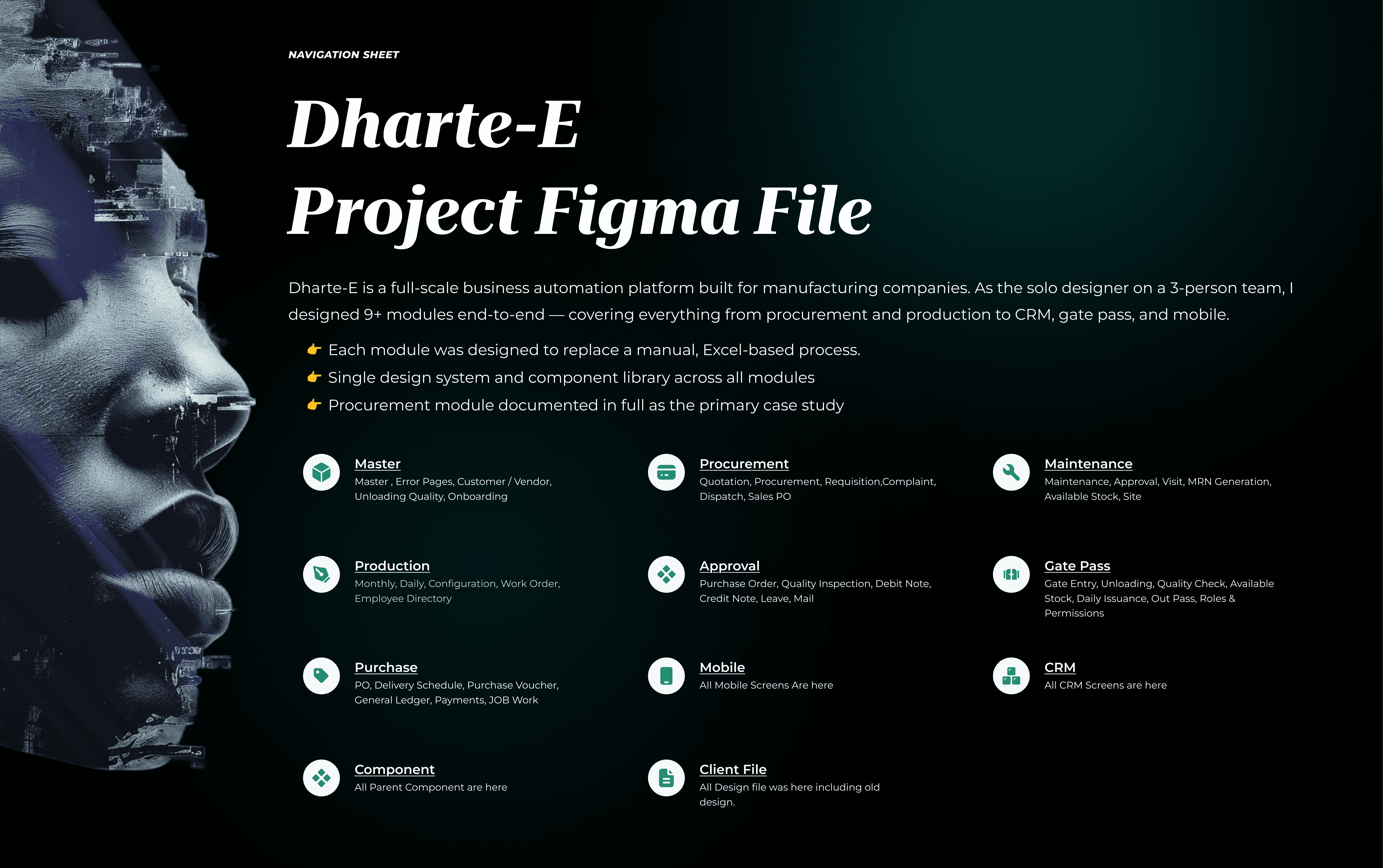
Nice Steel was running their entire procurement operation on Excel sheets, phone calls, and scattered email threads. I was brought in as the solo designer to replace all of it with a connected, end-to-end digital platform from purchase requests all the way to delivery.
Context
What this project was, and what I was hired to do
Nice Steel Industries is a bike parts manufacturer. I was brought in as the solo designer on a three-person team — me, a BA, and a PM — to design the Procurement Module as part of a larger business automation platform. The scope was one module, but the decisions I made here shaped the architecture of everything downstream.
This is what procurement looked like on day one. Every step was manual. Every handoff had no confirmation. The process depended entirely on specific people being available and remembering to act.


PROBLEM
The real problem wasn't inefficiency. It was invisibility.
Nothing crashed. Nothing threw an error. Things just moved slowly, got stuck, and got lost — making it harder to fix, because the system looked like it was working until a deadline was missed.

Users & Roles
Who this was designed for and why each role matters
Before designing a single screen, I mapped out who touches the procurement process and what each person actually needs. Four distinct users. Different goals, different access levels, different pain points.


Research
Diagnosing the friction
We didn't jump straight to wireframes. Before a single screen was opened in Figma, we spent two weeks understanding exactly what was broken and why through structured stakeholder interviews.


Turning Point
One decision that changed the entire architecture
Partway through requirements, we hit a moment that scrapped two weeks of thinking and forced us to redesign the entire module structure. This is the decision I keep coming back to.
We'd been designing the Purchase Request flow with one item per PR. Simple, clean, easy to track. Then someone asked the obvious question: what does this look like at actual scale?
Nice Steel doesn't raise one request for one item. They raise requests for dozens of items across multiple vendors, regularly. Single-item PRs would flood the system — the platform would create more administrative work than the spreadsheet it was replacing.


SOLUTION
What we built — and the exact thinking behind each decision
We didn't just design screens. Every layout, every interaction pattern, every piece of structure came from a specific insight or constraint. Here's the full picture.
Procurement Listing
Status first. Scan in seconds.
The listing screen gives the procurement manager a full view of everything in motion — PRs, their stages, and who owns each action. No calls needed to know what's happening.
RFQ Generation
Personalised vendor forms. Zero manual filtering.
The system generates a personalised form per vendor automatically — based on their order history. Vendor A sees only their items. RFQs move through four fixed stages: Quotation Awaited → Evaluating → Approval Awaiting → Quotation Approved.
Negotiation Log & Version Control
Record the journey, not just the outcome.
Every negotiation message is logged against the quotation. Every revised quote is saved as a new version — nothing is overwritten. Before this, negotiations over WhatsApp and email left no formal trail — a real compliance risk.
Quotation Comparison Table
Where the actual decision gets made.
All vendors surfaced side by side — item by item, with quantity, rate, discount, tax, and total visible at once. Before this existed, someone was manually copying numbers from email threads into a spreadsheet.
Vendor Form + PO + Delivery Schedule
Closing the loop from PR to delivery.
The vendor-facing form shows only what they need — no internal context, no complexity. Once a vendor is approved, a PO is generated directly from the approved quotation — no re-entering data. From there, delivery schedules are created with dates, quantities, and milestones. The loop that started with a purchase request ends with a confirmed delivery plan.


Trade-offs
What we chose not to do and the cost we accepted
Every decision to do one thing is a decision not to do another. Senior design means making those trade-offs explicit — not pretending everything was obvious or perfect.


Impact
What changed — and what we're set up to measure next
This was an internal enterprise tool validated on a development environment — not a live product with analytics yet. Being honest about what we have and what we don't.

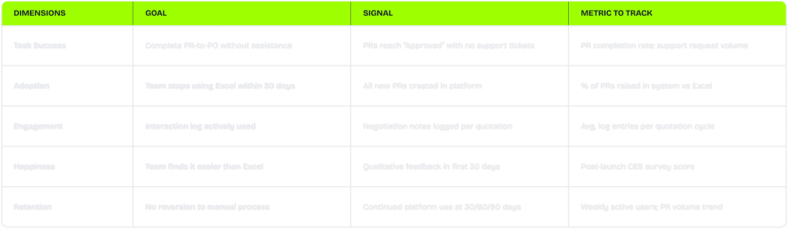
HEART Framework — goals defined for post-launch measurement

Learnings
What this project taught me about how I design
Asking "what happens at scale" saved the entire project We were two weeks into designing single-item purchase requests when someone asked how this would work at Nice Steel's actual order volume. The answer broke our assumption completely. That one question restructured the entire data model, the RFQ flow, the vendor forms, and the comparison table. I'll ask that question on every project from now — in week one, not week three.
The aesthetic of efficiency — for enterprise users, speed is beauty The procurement manager manages 10–20 active requests daily. When I designed the listing page, cards looked better. But cards would have slowed her down. A dense, scannable table let her process 20 rows in 30 seconds. I learned that for B2B power users, removing one unnecessary click is worth more than any visual polish. Usability is the highest form of design here.
Direct user access is non-negotiable — filtered research has a cost Most discovery came through the BA — structured and useful. But the comparison table was built vendor-first until I sat with the actual procurement manager and watched her read it. She read by item, not by vendor. Nobody would have told me that in an interview. I needed to watch her think. Earlier direct access would have caught it before it needed reworking.
When four people say the same thing unprompted, that's not a finding — it's a mandate Status visibility came up in every single stakeholder interview without anyone being asked about it directly. That convergence told me exactly where the foundation of the design had to be. I used to look for patterns across research. Now I look for moments where everyone says the same thing without knowing the others did too.
Continuous check-ins turned the final handoff into a formality On most projects, the final presentation is where everything is revealed and defended. On this one, every significant decision had already been discussed and agreed before screens were finished. The final review took 20 minutes. That rhythm — share early, share often, course-correct in small steps — is now how I want to work on every project.
I designed a gap I already know how to fix The listing page shows everything when you look for it. But a procurement manager with 15 open requests needs the system to surface what needs attention right now — overdue follow-ups, quotes expiring, approvals stuck for days. That proactive summary view was scoped out due to time. It's the first thing I'd build in phase two, and I already know exactly what it would look like.
